.jpg)
ART DIRECTION & BRAND IDENTITY RENEWAL 2022
We collaborated with Haurizi Industries Co. in creation of new visual BI and art direction, a distributor of seafood and grocery items.


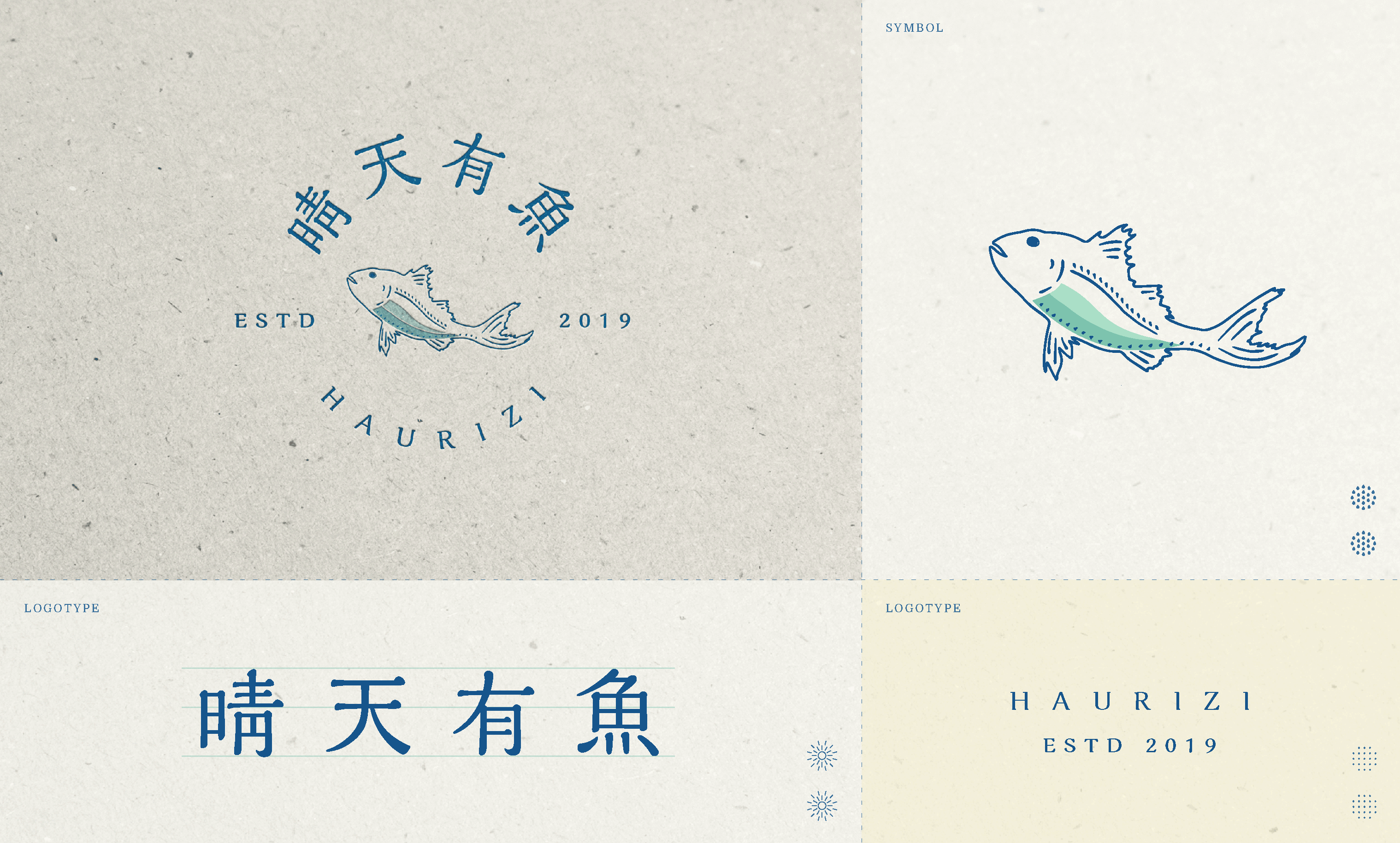
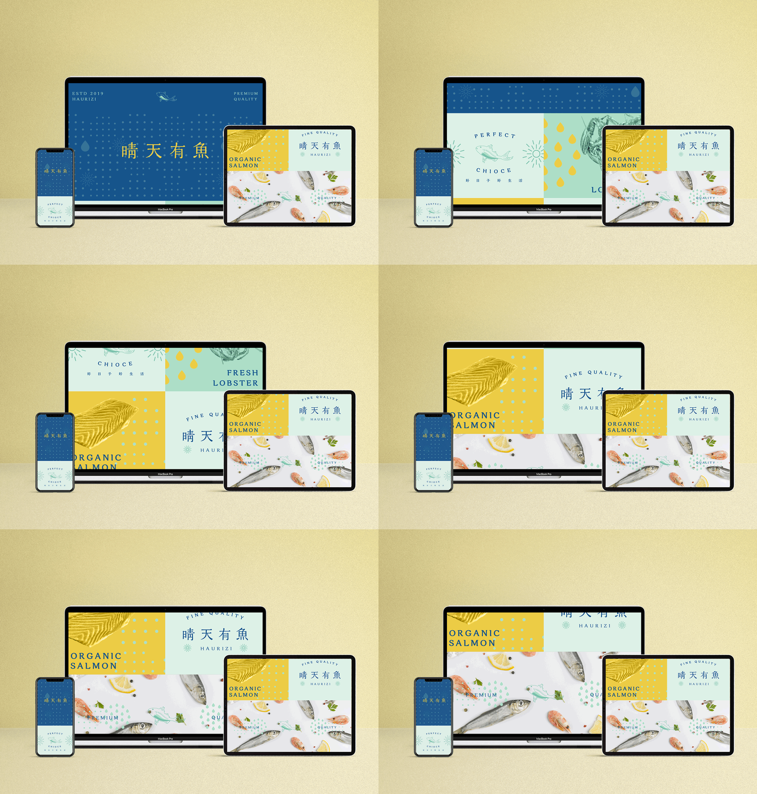
We kept the visual assets that emerged in the ‘Haurizi Seafoods’ - blue and fish symbol- and improved them to a fresher, more modern form. The newly defined ‘Haurizi brand palette' is a color with improved saturation and brightness. The new logotype is more powerful than the existing one, improving readability.


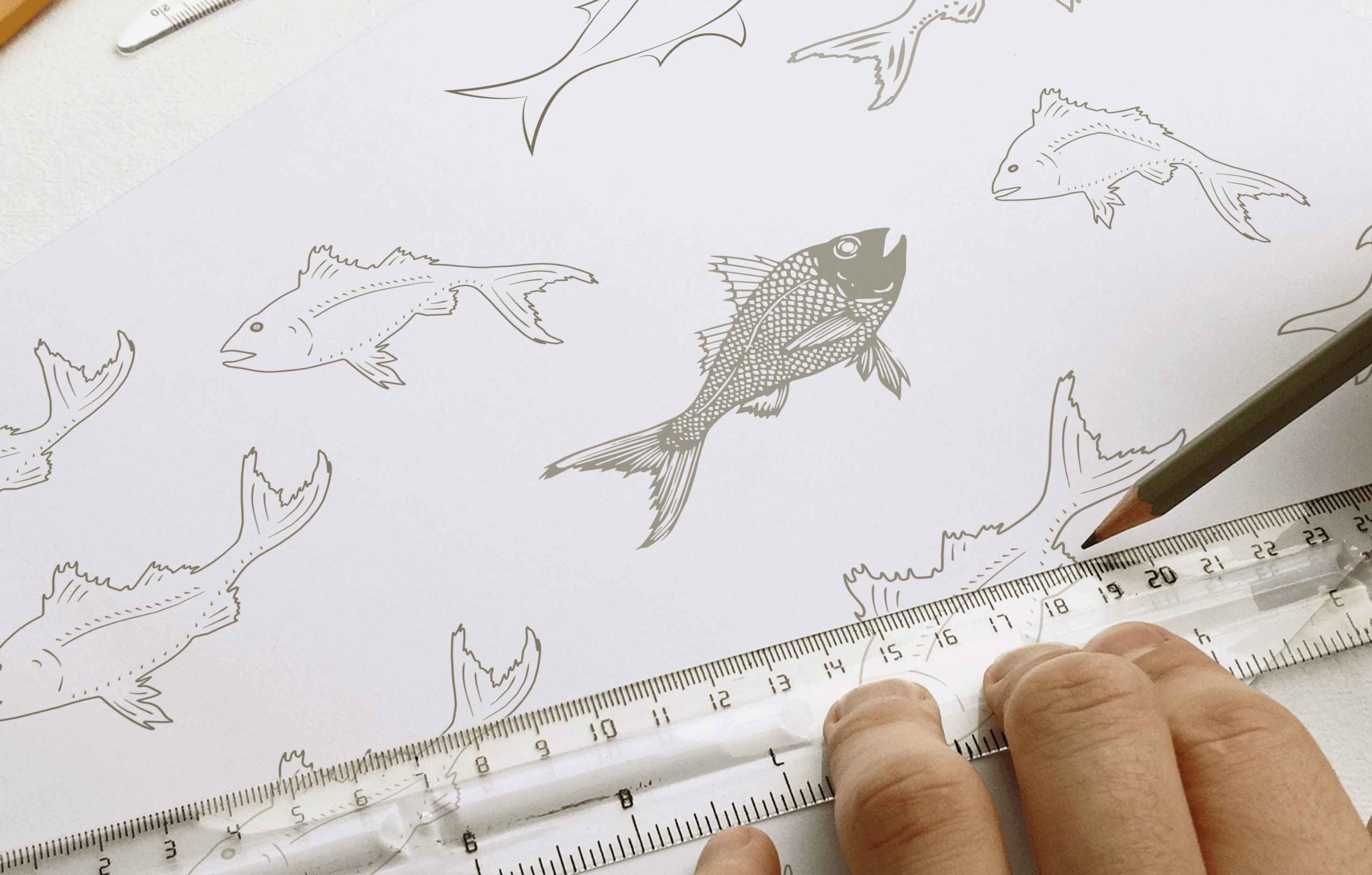
we designed brand pattern to represent brand's vision which refer to offer the customers a tasteful, healthy and ethical fish product.
There are three core colors to the Haurizi visual identity. We use three refreshing spectrum of lakegreen, ocean blue and sun yellow. The heart of our palette is yellow, thoughtfully represented throughout the packaging design.
It is a brand promise to maintain in a thoughtfully considered experience from the food to the design choices made.


