top of page
Pin Jun Jia Co., Ltd.
Visual Identity, Packaging Design, Brand Development
APIPIA has developed the brand identity design of Pin Jun Jia, a premium tea brand owned by Pin Jun Jia Co., Ltd.
The goal of this project was to position Pin Jun Jia as a gourmet tea shop where people can experience authentic Taiwanese tea with a modern reinterpretation.
Pin Jun Jia's contemporary, defined by APIPIA, pursues a harmony between, refinedness and naturalness, sincere and elegant, authenticity and modernity.
The symbol, combined with three atypical shapes, and Pin Jun Jia, means Pin Jun Jia's reinterpretation of the Taiwanese tea. The wordmark, with a subtle beauty, convey a refined impression with its elegant form. This three organic shapes of the symbol are used as a graphic motif in various items, and in PJJ products, it is responsible for a unique type of label.








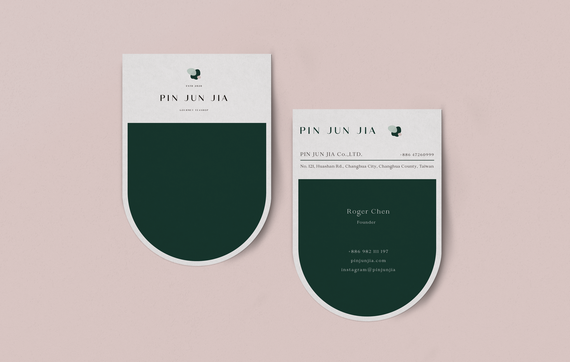


Pin Jun Jia Co., Ltd.
2020
Visual Identity, Branding, Brand Development, Packaging Design
Client :Pin Jun Jia Co., Ltd.
bottom of page