top of page
Well William Café
BRAND IDENTITY, BRAND DEVELOPMENT,PRINT, STATIONARY, PACKAGING DESIGN SYSTEM
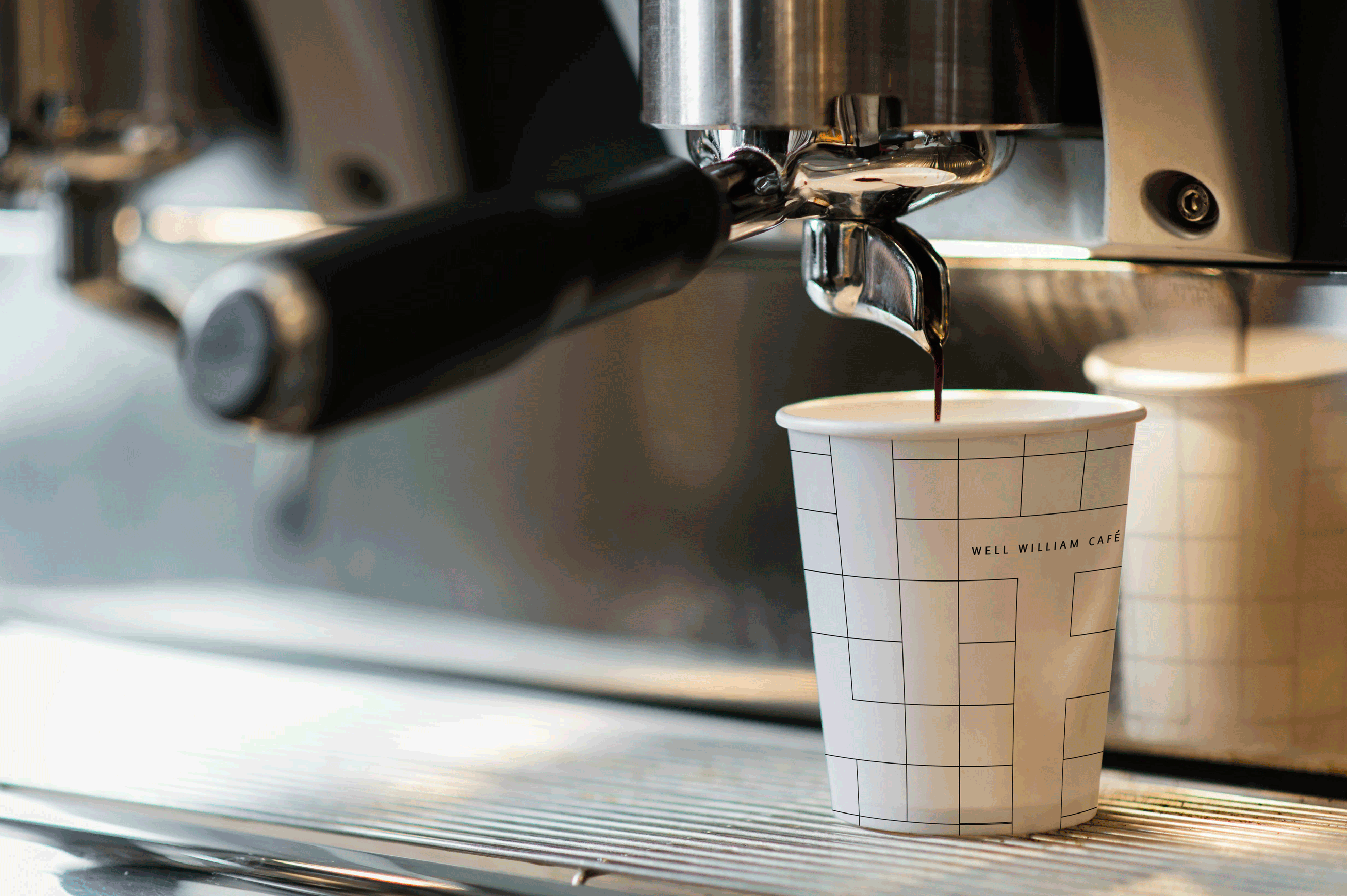
A coffee addict, weary of the commercial coffee enterprise, overly roasted beans, decided to open a roastery for people who were clamoring for the actual taste of fresh coffee.
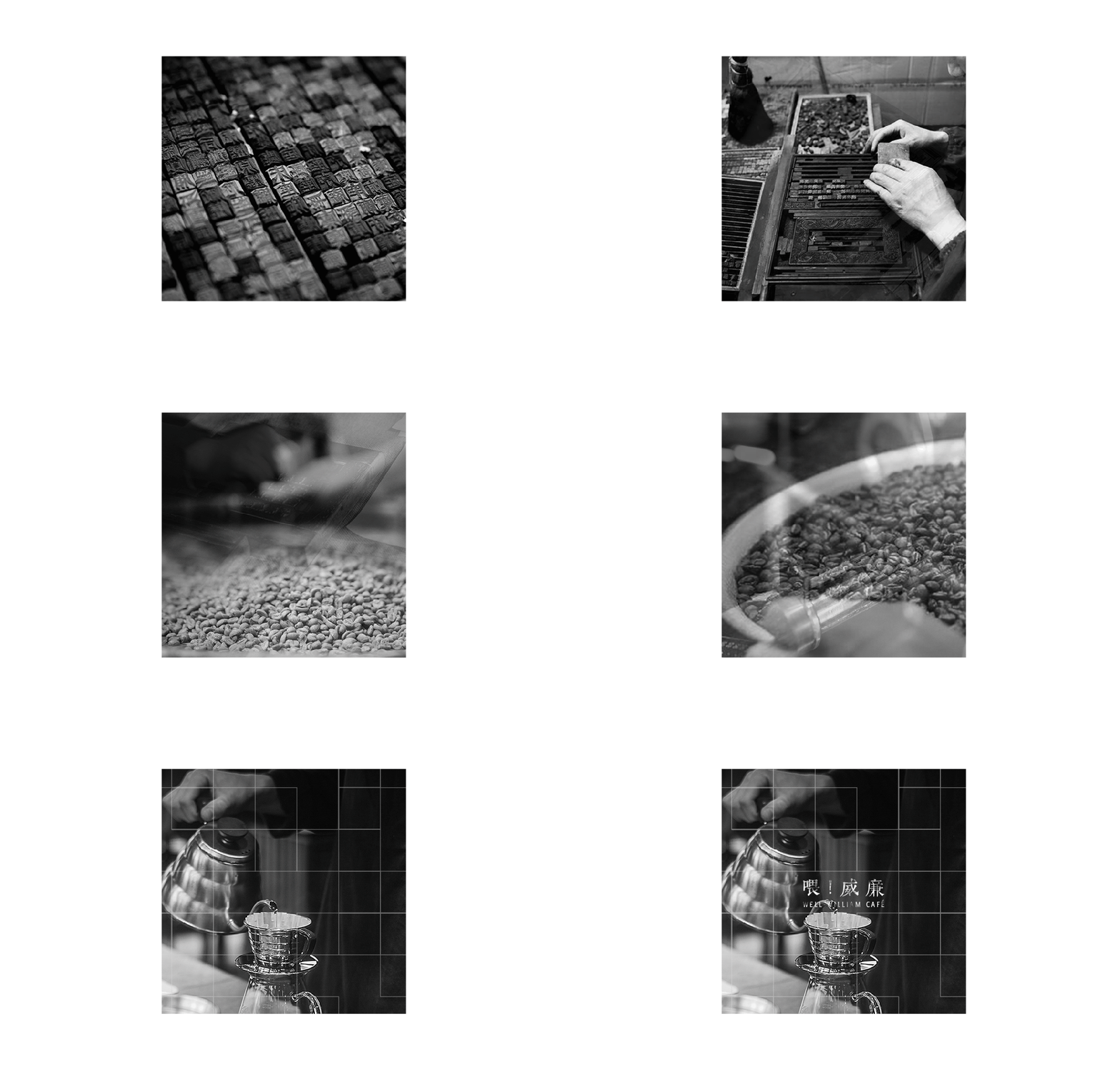
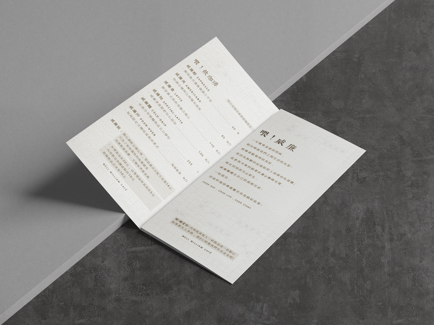
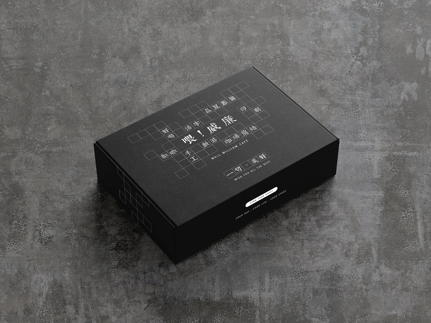
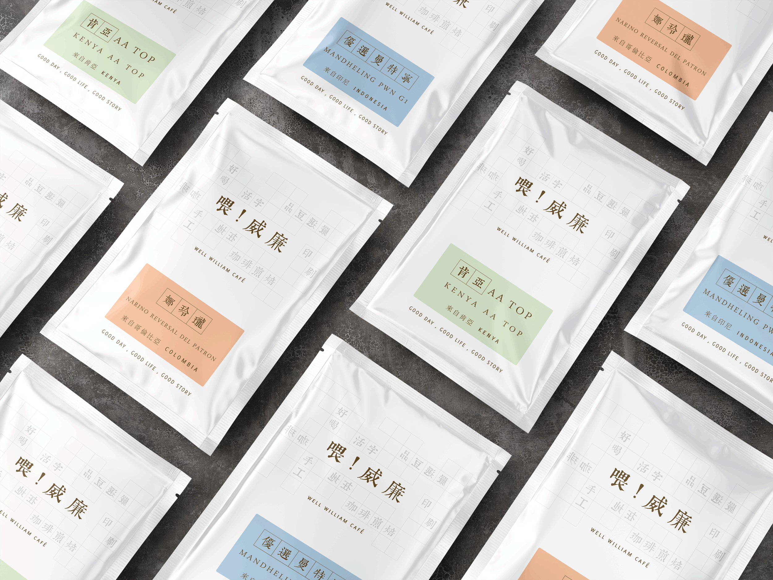
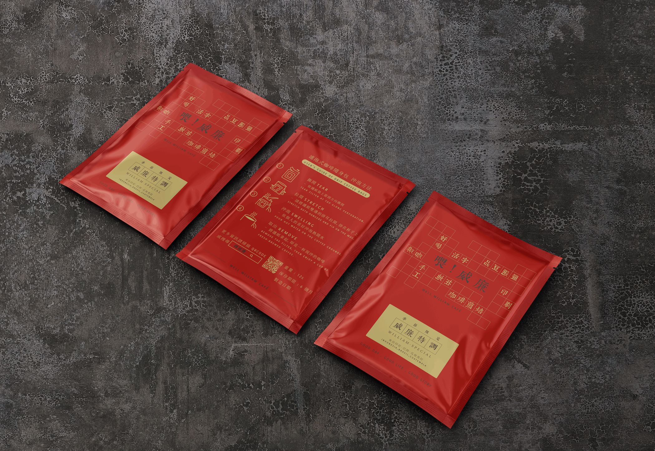
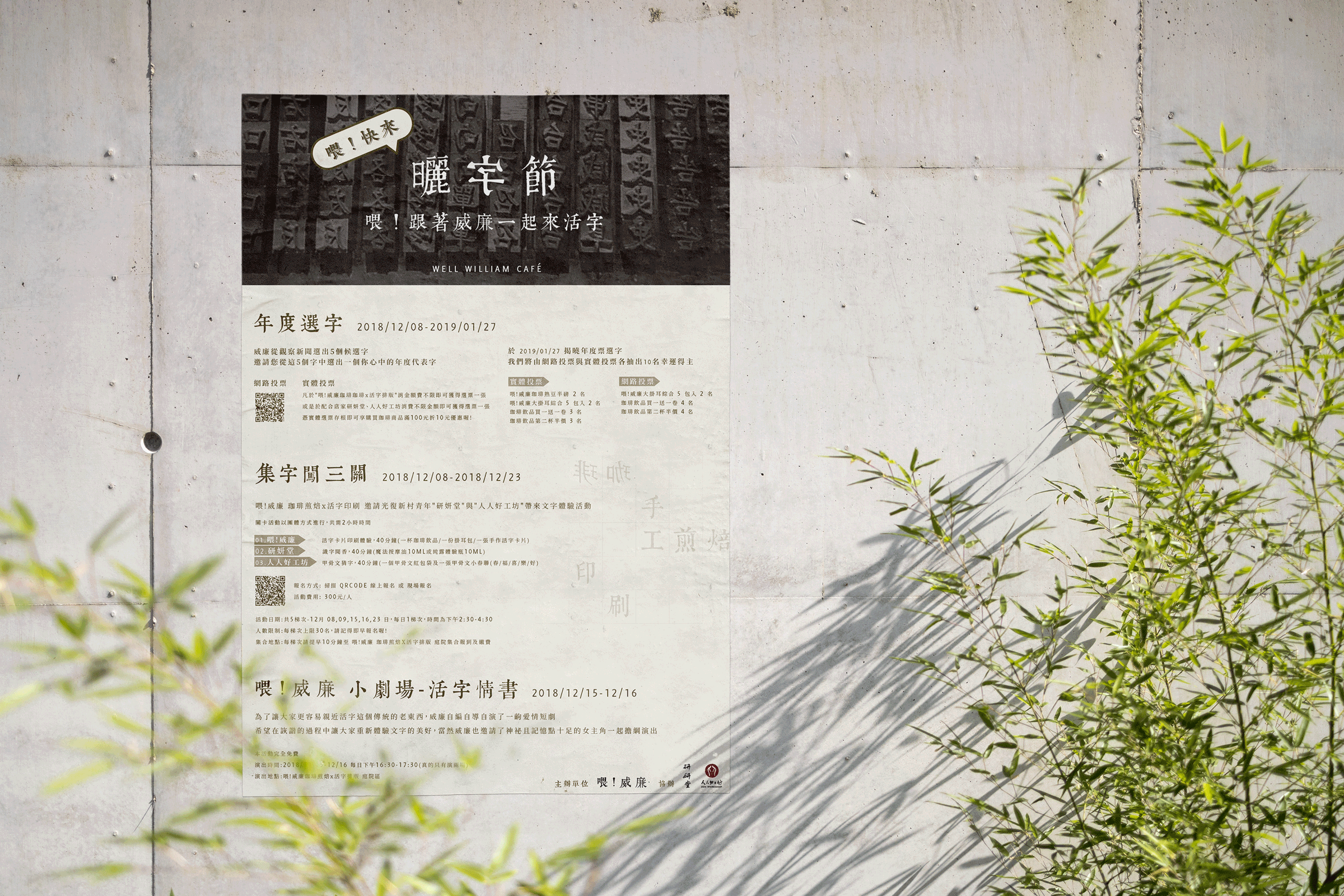
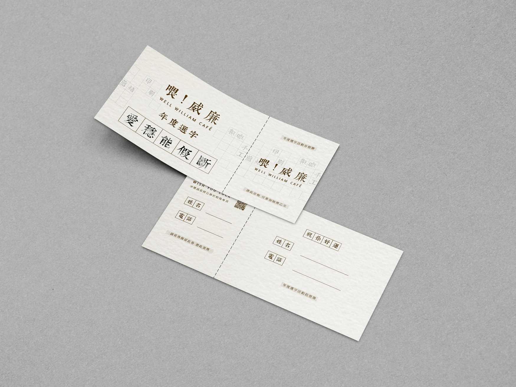
Our inspiration for the Well William Café came from early 11th century Chinese typography printed labels. Well William Café’s founder William, his family used to own a family print business. Our idea was to represent the passing 50 years of William family’s roots by using ancient Chinese typography print technique. We drew on the soft, earth tone colors prevalent in the print techniques of those days to lend the brand design system, print and packaging a classic, timeless quality.










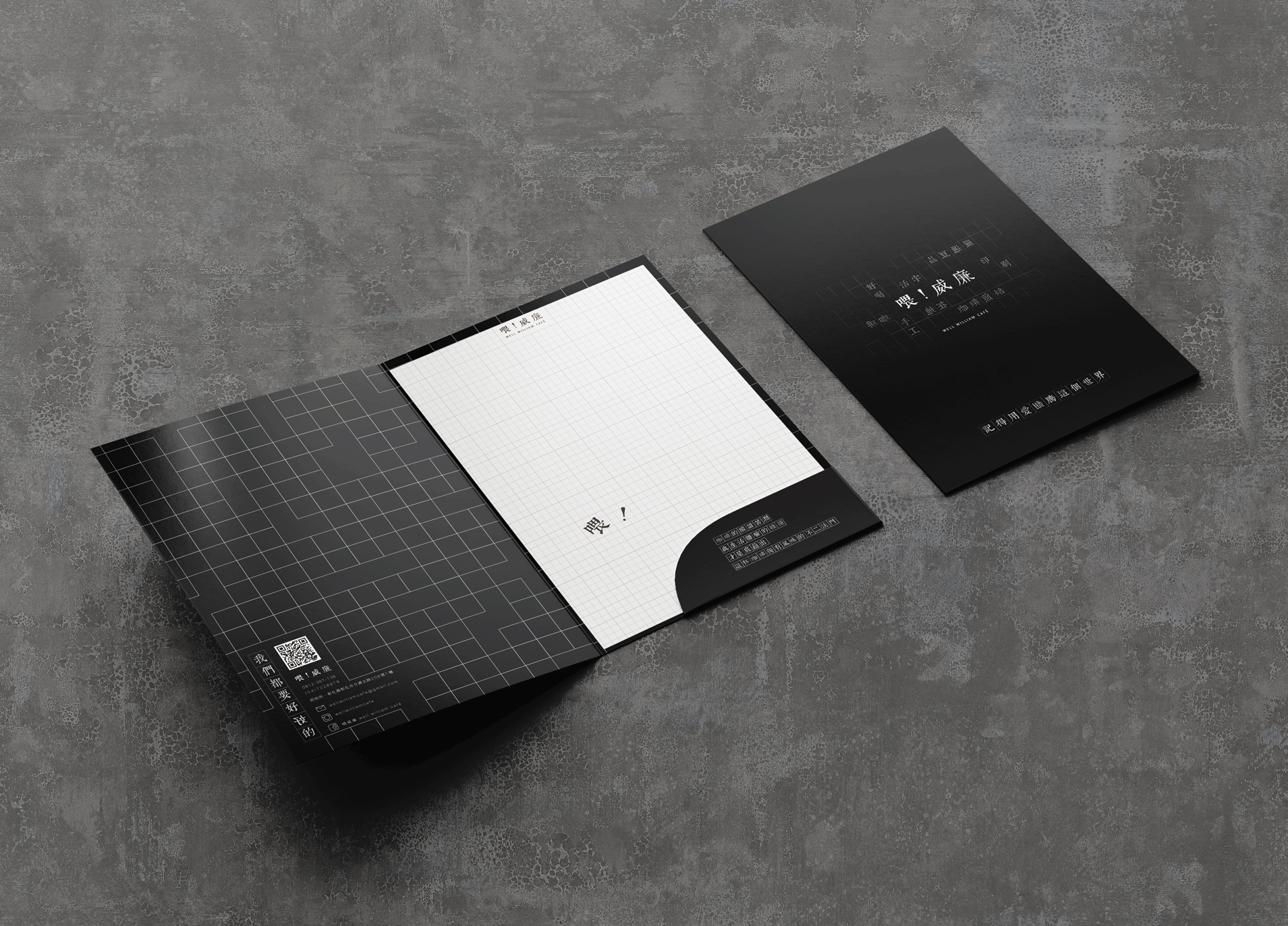
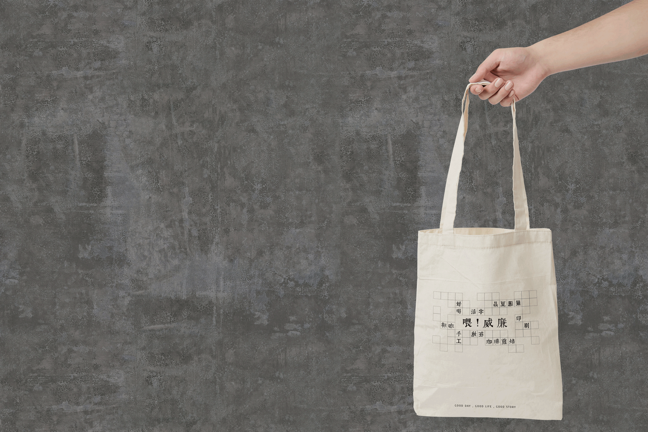
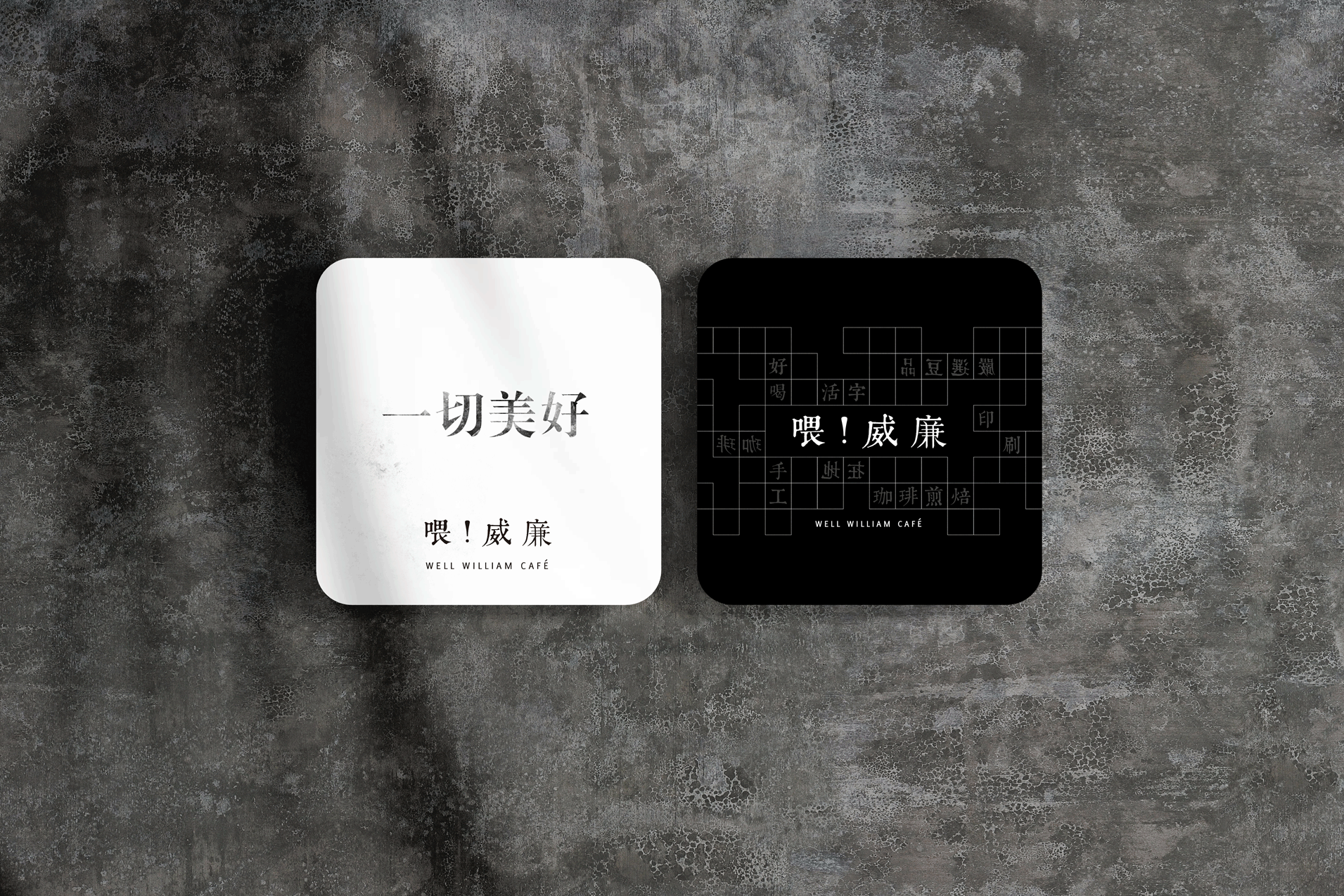


Well William Café
BRAND IDENTITY, BRAND DEVELOPMENT,PRINT, STATIONARY, PACKAGING
Client : Well William Café
bottom of page


